
UI/UX/Product Designer
Cross Belt Dashboard Redesign
Redesigning the Tilt Tray Cross Belt user interface for Honeywell’s materials handling enterprise applications
Overview
The Tilt Tray Cross Belt (TTCB) is an automated storage and retrieval system for shipping and distribution centers.
My role as the lead UI Designer was to update the user interface of the TTCB software to align with Honeywell’s newer “Momentum” design language.
I also examined micro interaction and devised ways to update the the user flow.
Role
Lead UI/Product Designer
Team
Product Managers, Product Owners, Mechanical Engineers
Duration
4 months
00: Project Background
The Cross Belt dashboard is the digital component of an automated storage and retrieval system (ASRS). Generally speaking, an ASRS stores and retrieves packages in order for them to be sorted and sent to the proper delivery truck when it’s time to ship.
If you’d like to learn more, check out the video below.
This is an incredibly intricate piece of hardware and it needs constant supervision. In addition to the hardware, Honeywell provides software that enables system engineers to monitor and manage the system. They utilize dashboards to look for any faults and errors, and to make sure that the system is performing at its operational efficiency.
01: Project Goals
Project Goals were to:
- Find ways to revamp and increase usability of the dashboard and be aware of what the technical limitations were
- Upgrade the UI to Honeywell’s new “Momentum” design language system where possible
- Design a key performance indicator (KPI) to help systems engineers readily ascertain the status of the hardware components
02: Research & Insights
Considerable research onto the usability of this project had been completed prior to my involvement. But it was obvious, the UI needed an overhaul. Common reactions to the usability of the legacy interface fell along the lines of “outdated,” “too complicated,” and “difficult to understand what actions were available at a given time.”
These insights were provided to me by our UX Researches and the engineering team – both of whom had spent considerable time with our client at earlier stages of this project.
As I joined the team, I made sure to schedule sessions with the product and engineering teams to learn about the existing system. What is the hardware and how does it run? What do statuses like “occupied” and “enabled” mean?
I found the engineering team to be full of insights. They were well aware of what everything did and have received a lot of feedback over the years. Understanding their comments and concerns was crucial to being able to make any improvements.
03: Concept Development
After learning more about the project, I built a mind map using Miro to help visualize the scope of this project. I wanted to give myself (and my stakeholders) a clear view of the functionality of this interface. I always find it helpful to have a visual reference that a team of stakeholders can react and respond to.
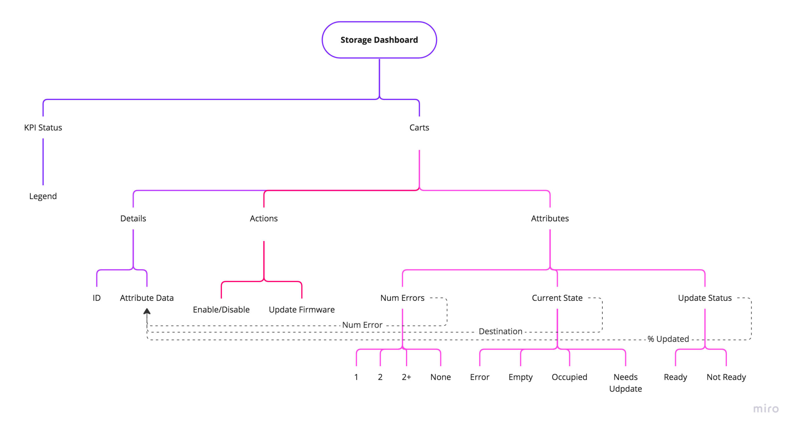
Another important consideration is that the new design language system is geared to be more compatible with tablet and mobile development, and thus, should not rely on any right-button mouse clicks or keyboard shortcuts the way the legacy UI does. How might that affect my design?
04: Wireframes
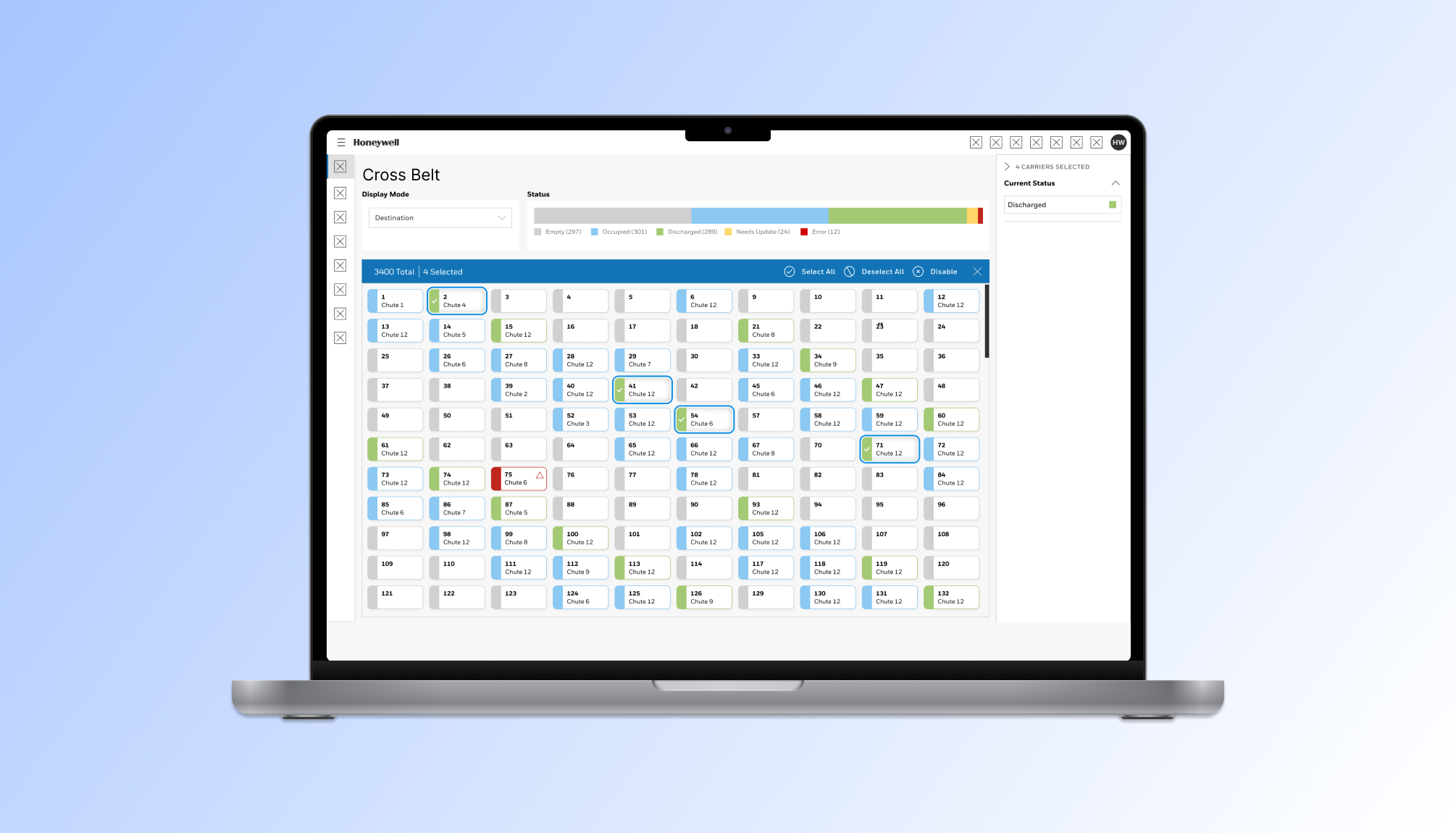
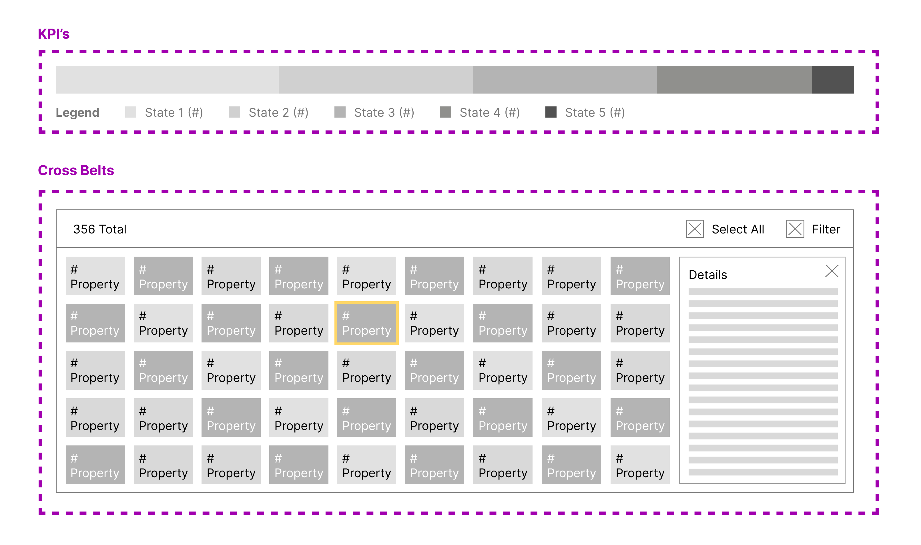
Based on what I had learned at this point, drew up some wireframes of to show potential solutions. The one below includes a key performance indicator at the top of the screen and allows system engineers to see global percentages and the states, while all of the individual cross belts are shown below.
Selecting one of the belts (yellow border, #12) opens up a side panel with any additional data for the given belt.
05: Final Design
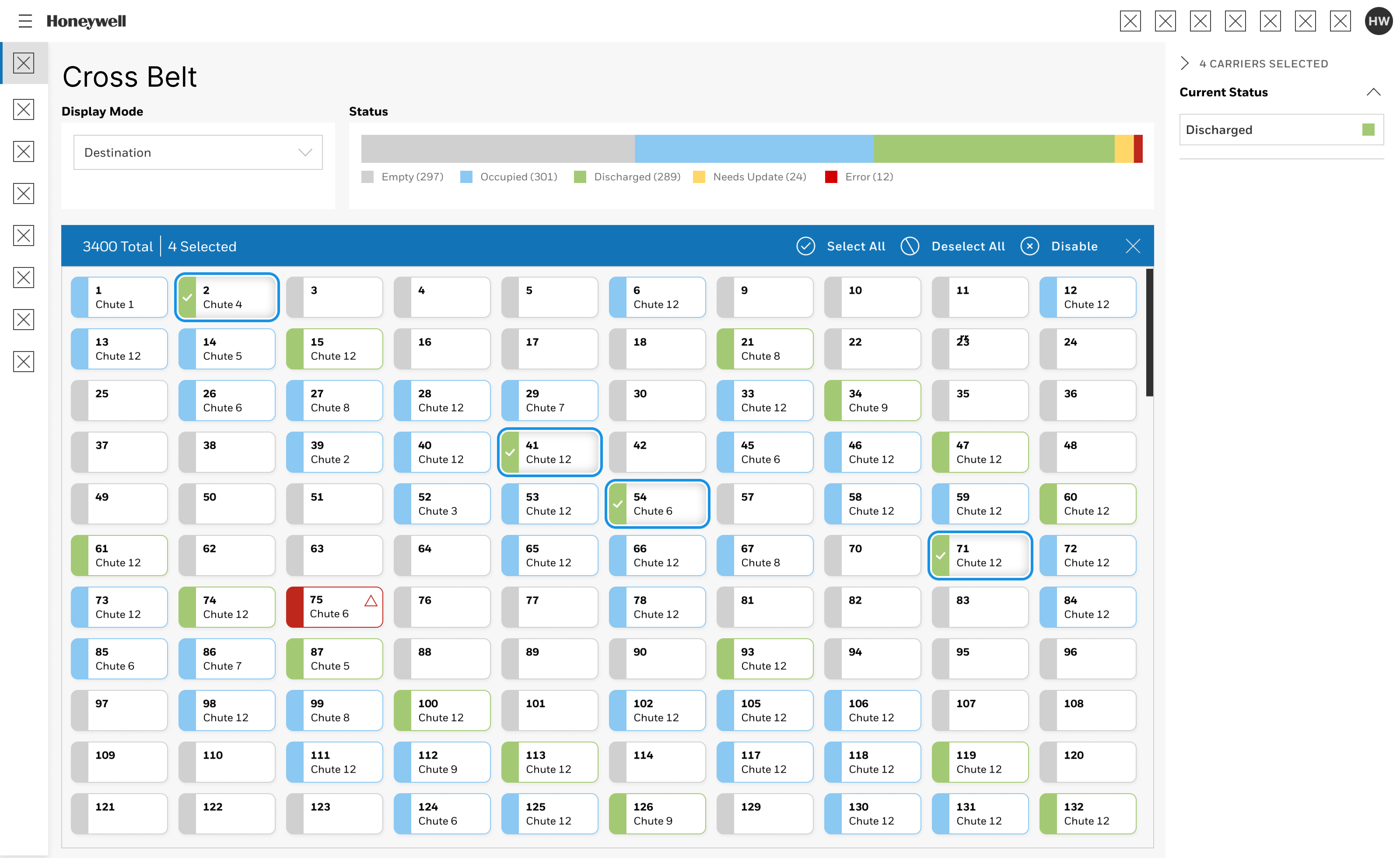
Above is the final design! What we are looking at here is a visual representation of all 3400 cross belts in this given system.
Four are selected, and one has an error that the user will need to address.
06: Interaction Details
Visual Treatment for Individual Components
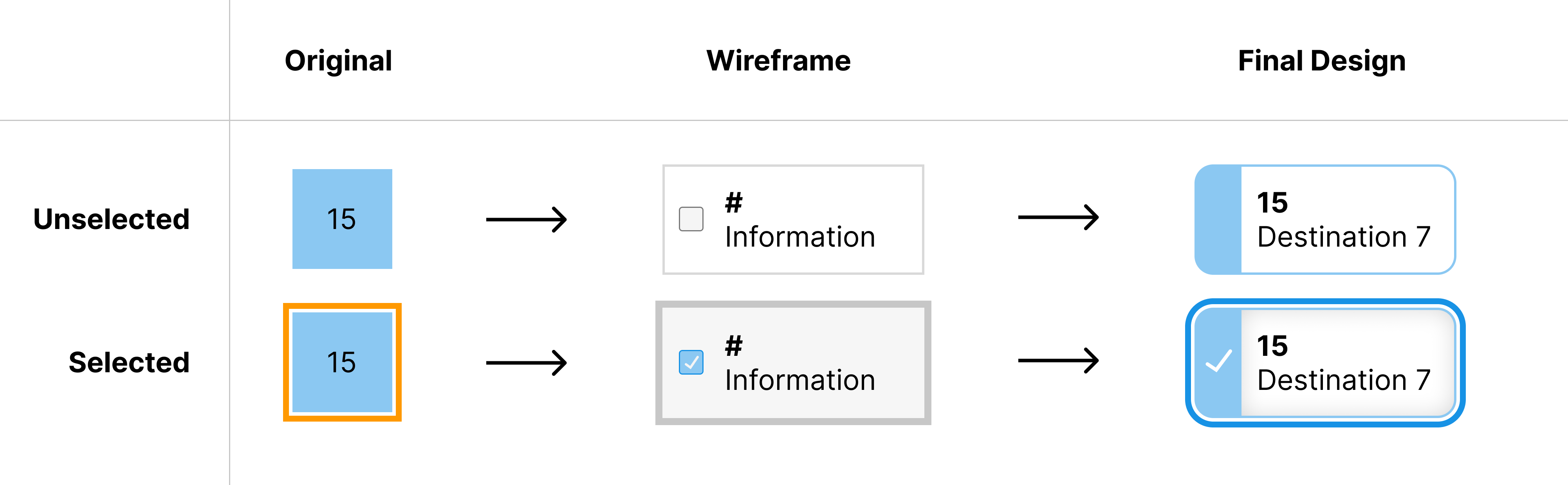
The first order of business was to redesign the visual treatment of the individual components.
I wanted to the new design to accomplish several objectives:
- Increase the size in order to make each component be more interactive and display more data
- Improve the interactivity so a keyboard or mouse right-click is not needed
- Expand the use of color coded states
Below, we can see the original component design (left) and my final proposal (right), with a wireframe iteration in the middle.
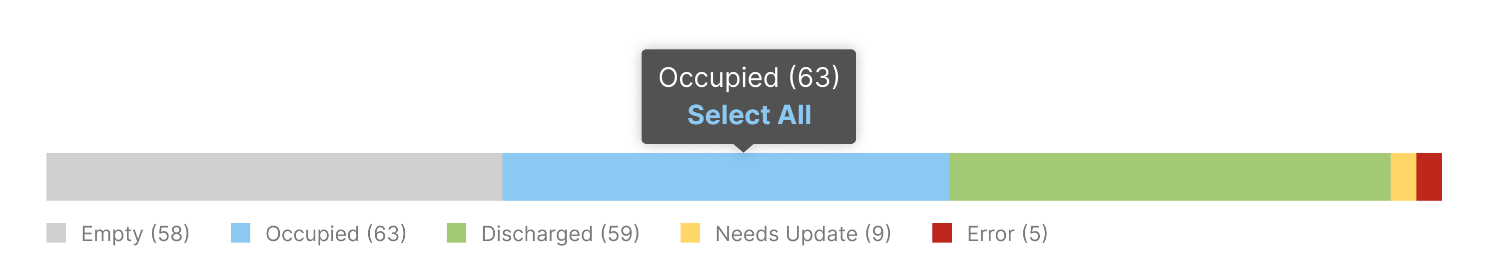
Key Performance Indicator
Next, we see a closeup of the key performance indicator below. When the user hovers over a segment of the KPI, a tooltip appears with the state name and number. The bar graph of the KPI provides the user with an estimated idea of how many occupied carriers there may be. But hovering over that section will prove an exact number, along with the ability to select and filter through all of the components.
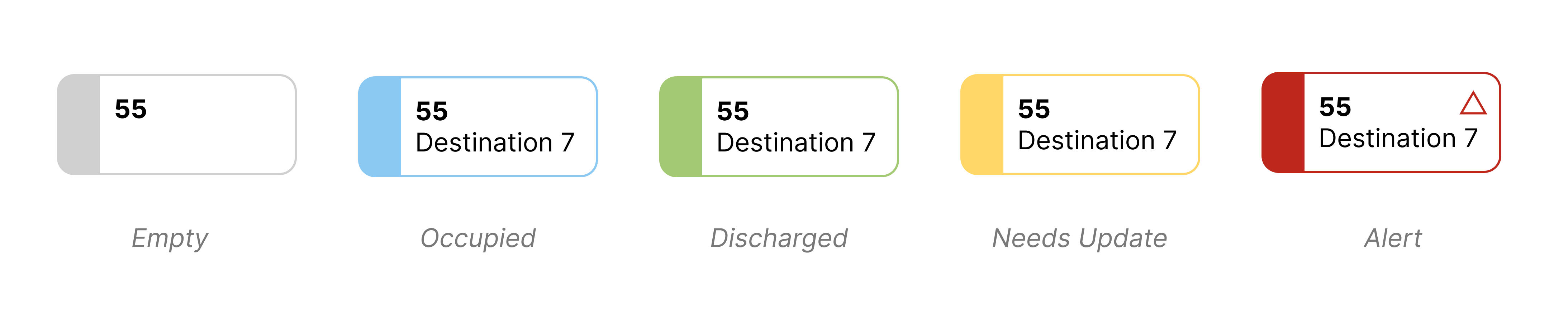
States and Alert Statuses
This cross belt system includes four normal states, and a fifth that’s an error or alert status. It is bright red and contains an extra icon to highlight its visibility.
In an operational system, the belt will cycle through being empty, then occupied when a product is on it, and then discharged when it’s removing that product.
The TTCB is a product within a larger software ecosystem where there is already an established error notification behavior. As such, any error generated by the TTCB will also be viewed in the parent product in accordance with our notification strategy.
07: Takeaways & Next Steps
While it may look like a straight forward process to arrive at a revised UI, this project involved many animated discussions between the rest of the design team and the engineering team. Having so much information to show to a user is a big challenge.
I’m proud of the way the updated Cross Belt Dashboard & UI turned out. I accomplished what I set out to do:
- to improve the visual design and relate it to Honeywell’s new design language
- eliminated the need for keyboard controls and right clicks – notably relevant when selecting multiple belts
I received positive feedback from my manager, other designers, the engineering team, and the development team. One developer built an entirely new framework for similar components based off of my design for this interface.
If I could explore an additional aspect to this project, it would be to review the system metrics and participate in customer feedback to validate my work and my decisions.
