
UI/UX/Product Designer
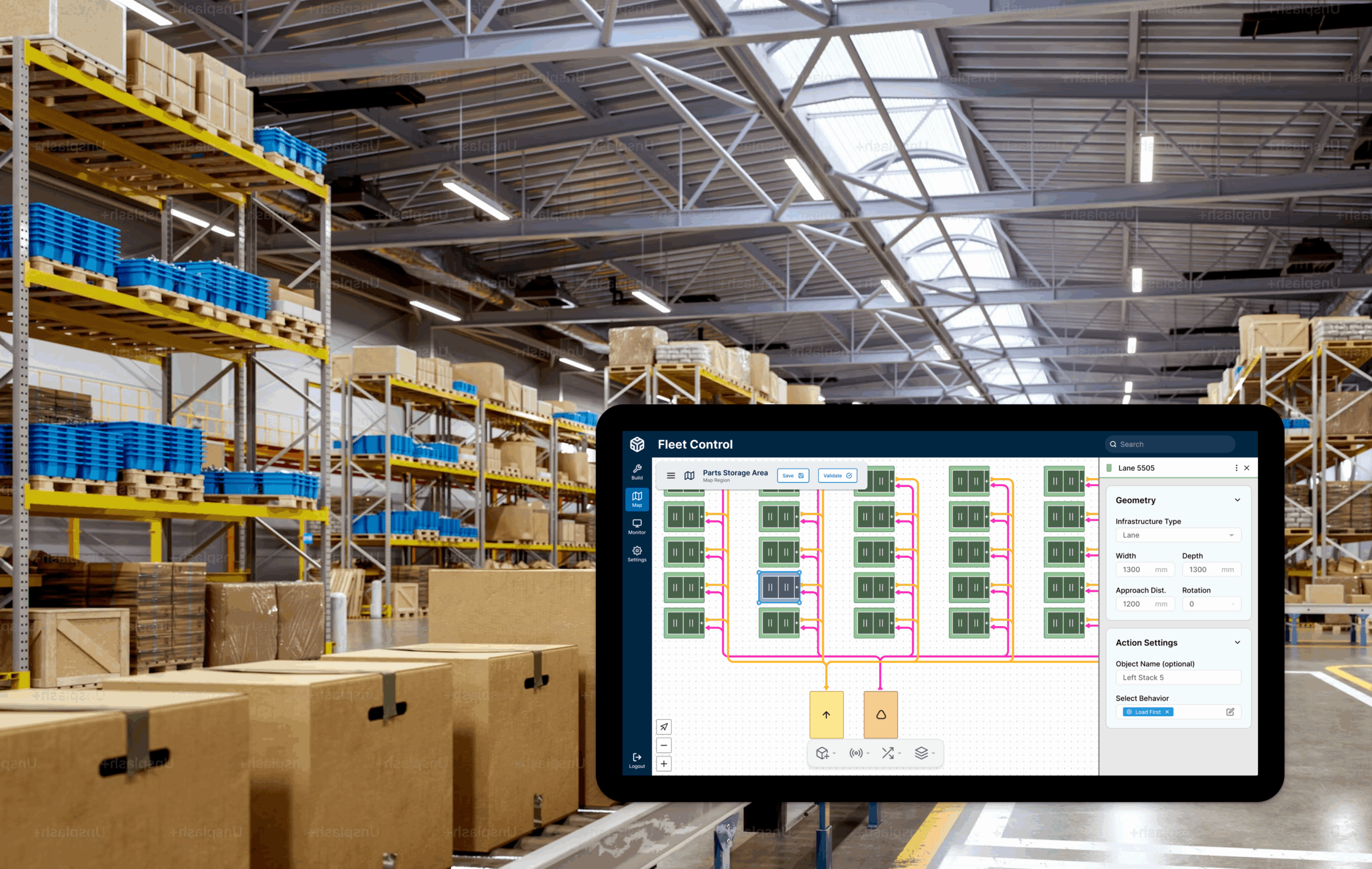
Autonomous Vehicle Mapping
A walk through of the Autonomous Vehicle Mapping tool, intended to help internal teams configure and manage material flows more efficiently
Overview
This case study documents the design and functionality of the Material Routing Planner for Seegrid. It is an enterprise platform that enables users to replicate a physical space on a virtual 2D map, and manage the flow of materials throughout the facility.
This feature is used by Seegrid engineers to configure Autonomous Mobile Robot (AMR) workflows at customer facilities. It enables engineering teams to implement new specifications over 14% faster, saving valuable time and achieving a key business objective.
Role
Design Lead
Team
Front End Engineer, Back End Engineer, Product Manager
Duration
4 months
✨Highlights✨
How Autonomous Vehicle installations at new customer facilities are transformed by a new mapping tool that saves teams time and money and adds versatility to the product.

My Solution
Material Routing Planner User Experience & Interface
This interactive experiences lets engineers:
- Map out and replicate physical layouts in a digital space
- Create connections between objects by determining where goods should be moved to
- Receive instantaneous visual feedback of their work
- Easily explore and and keep track of (and modify if necessary) a large quantity of Paths

Breakdown of the UI

Problem Statement
Old Versus New
Seegrid’s mission is to provide comprehensive logistics support to their customers, with a focus on managing the flow of materials within facilities. To that end, their core products include fork-lifts and tugger vehicles. Each vehicle needs to follow preconstructed paths, comprised of groupings of smaller directions. The creation and management of the paths has traditionally been a very time-consuming task, and one that leadership identified as a high priority for improvement.
Currently, creating a new path requires an operator to drive a vehicle along the desired route, possibly multiple times to account for various permutations. In a large and complex facility, this could take weeks of valuable time. Furthermore, if any coordinates needed to be changed, much of the work would need to be done again. We challenged ourselves to find a better way.
The solution? Designing and implementing a digital experience and UI where users can:
- map out a facility and add components, such as walls, stations, storage areas, etc
- create paths by designating which objects should be connected and how
- receive instantaneous visual feedback of their work
- easily explore and manage paths (and accept changes if coordinates need to be modified)
Early tests showed that this solution was estimated to speed the installation process by 14%, saving valuable time and resources.
Project Background

Seegrid has been a leader in the autonomous vehicle sector for over 20 years. Their technology enables engineers to install a fleet of AMRs at customer facilities, and build a network of connections that AMRs will utilize as they transport materials around a space. Current solutions require that each pathway needs to be “trained,” essentially being shown by a human where to go. While this solution works extremely well, it is a cumbersome manual process that takes a long time in more complex facilities, and if any coordinates needs to be altered, much of the work will need to be restarted.
Leadership prioritized creating a better solution. Early conversations led our teams in the direction of creating an interactive map experience where Seegrid engineers could build out sophisticated customer facilities, plan virtual pathways, and maintain and monitor the system. That’s where the design team (and my work) came in. How do we build a new UI that best enables our users to configure customer facilities in a timely and efficient way? One that can easily react to changes and updates, provide direct feedback, and provide easy access to review and analyze past work. Read on!
Users
Who will use the map?
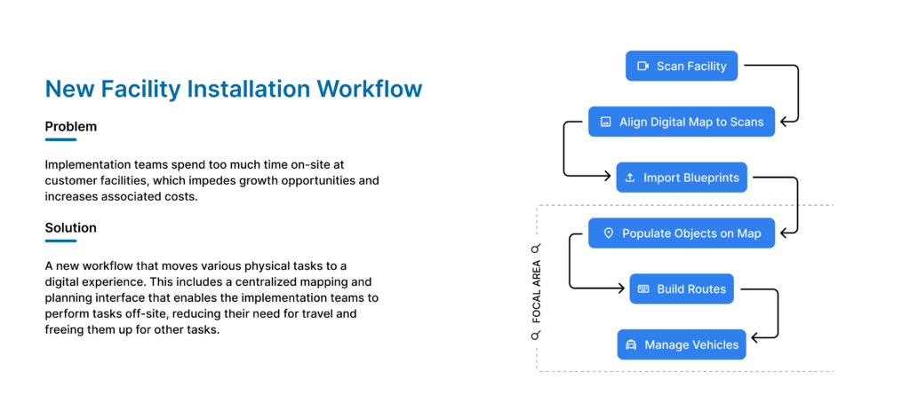
Let’s take a look at who does what for Seegrid at customer sites. The installation engineering teams perform a lot of heavy lifting as far as getting a customer site up and running goes.
They initialize a new map, which covers a lot of the highly technical details that are out of the scope of this case study. (Ensuring the map is aligned, configuring servers, etc.) Then, they populate that map with various components (storage areas, pick/drop locations, etc) and they determine how the components will interface with one another and they will manage that network of paths.

Flowchart
This features of this UI are broken down into three categories:
- Configuring work spaces
- Users are able to drop in objects in order to replicate the physical space on the virtual map
- Creating Object Paths
- This mode assists the users in connecting objects via paths. Due to technical and safety requirements, no objects are connected by default. Based on customer needs, a robust path network will be created.
- Managing existing paths
- This process assists with the discovery of the path network. Based on what the user has selected, related pathways will be highlighted.

UI Breakdown
Placing Objects on the Map

Empty Canvas
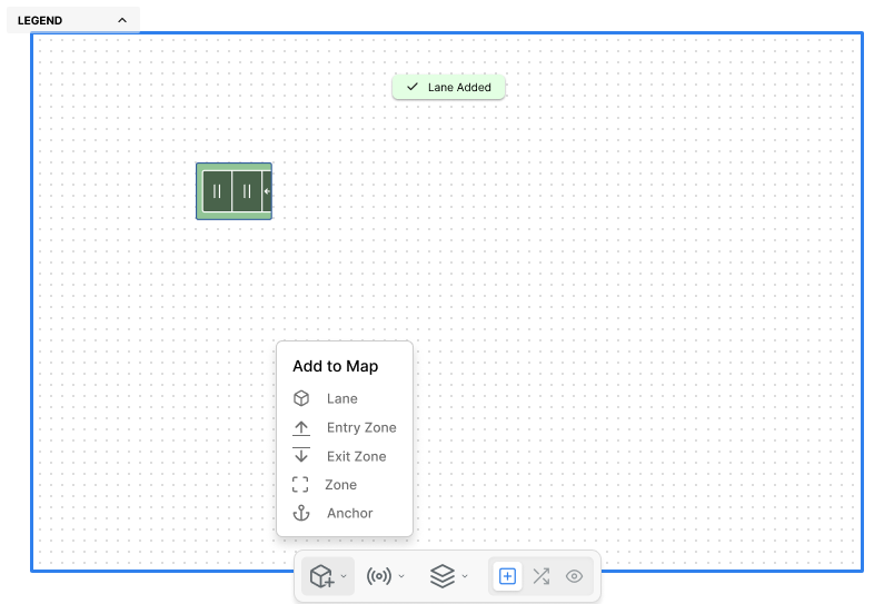
We see how a user is adding a Lane to the map with the “Add to Map” menu.
One Lane Added
One lane has been added to the map, and a small toast notification appears to confirm this. The user can continue add objects to the map.

All Objects Added
Skipping ahead a few steps, we see a fully built out section of map. The legend panel is open to help users relate to what each object is.

Properties Panel
The primary method of adjusting parameters for an object is the Properties Panel. It appears when an object is selected in this mode.
Connecting Objects
When the user enters the Connecting Objects mode, the color overlays change. Instead of different colors representing different types of objects, the color overlays represent what’s selected, what’s available to be selected, and what’s not delectable. To maintain accessibility, the design attempts to not rely sorely on colors, but to also incorporate different border widths, iconography, and confirmations within the Properties panel.

Nothing Selected
The user has entered the Connecting Objects mode. Nothing is currently selected, and the user is being prompted to select a Source object to continue.

Source Selected
The user has selected a Source, which is reflect in the Properties panel. They are being directed to the next step, which is to select a Destination Object.

Source & Destination Selected
The Source and Destination has been selected. The user is shown a dashed line approximating the path that will be drawn. It’s at this point that the anchors become selectable. Anchors can be used to tweak the AMR Path.

Anchors Added
Three Anchors have been added to modify the AMR Path. The user has confirmed their choices by clicking on the “Connect Objects” button. The Path becomes a solid pink color and the user receives a confirmation toast.
Managing Routes
After the user has mapped out a facility to their specifications, it’s time to establish connecting pathways. There are 3 types of connections available within this UI.
- Entry point to a Lane (this is how an AMR arrives into the work area)
- Lane to Lane (this is useful when a pallet needs to be moved to a different spot)
- Lane to Exit point (this is how an AMR leaves from the work area
Below, several types and behaviors of object connections are shown

No Connections Made
We see that the Entry Point is selected (shown in blue with a border) and the properties panel reflects what is selected and what it’s connected to.

Entry Point Connections
We see the outbound arrows from the Entry Point connecting it with 10 Lane Objects and the properties panel reflects this.

Lane 5 Connections
We see that the selected object is Lane 5, and we can also see the inbound and outbound connections designated by arrows and different colors.

Two Lanes Selected
We see here that selecting two lanes will display any existing connections between the two. This feature is most useful when the user wishes to modify or remove connections. It aims to reduce the cogitative load on the user by reducing the amount of extraneous information shown.
Conclusions
What Was Learned?
This was a fantastic project to lead. For one, this was cutting-edge technology and a true partnership between design and hardware engineering. Almost every week, the design team was given new technical parameters to work with. Sometimes, there was a technical limitation that engineering encountered, and our teams would need to alter the user flow.
Rapid prototyping became one of the most helpful tools in our arsenal due to the ever-changing capabilities that needed to be accounted for. It became a way of capturing all of the changes that were shared in a given week, and served as a foundation for on going discussions of what worked and what was missing through our many iterations on the way to our MVP.
A personal aspect to this challenge is the sense of having something “all figured out.” This project forced our team to let go of solutions we had arrived at and forced us to reexamine and reevaluate our ideas. As such, we became very familiar with the ins and the outs of this product and were on hand to communicate its nuances to leadership and other stakeholders.
