
UI/UX/Product Designer
Redesigning Honeywell’s Data Table Component
Over 70% of Honeywell's Productivity Edge app relies on the table component. Here's how it was improved to match product needs.
Overview
I served as the lead designer for the Productivity Edge web application – a software solution that Honeywell’s customers use to manage people and hardware within their shipping and distribution facilities.
This case study exemplifies my efforts in redesigning the generic data-table UI component to one that best fits the use cases and needs of the upcoming version of the app.
Role
Design Lead
Team
Product Owner, Engineering Manager, and other participating stakeholders. Four UX Designers and Managers provided continual feedback.
Duration
6 months
My Solution
Perfecting the Data Table Component
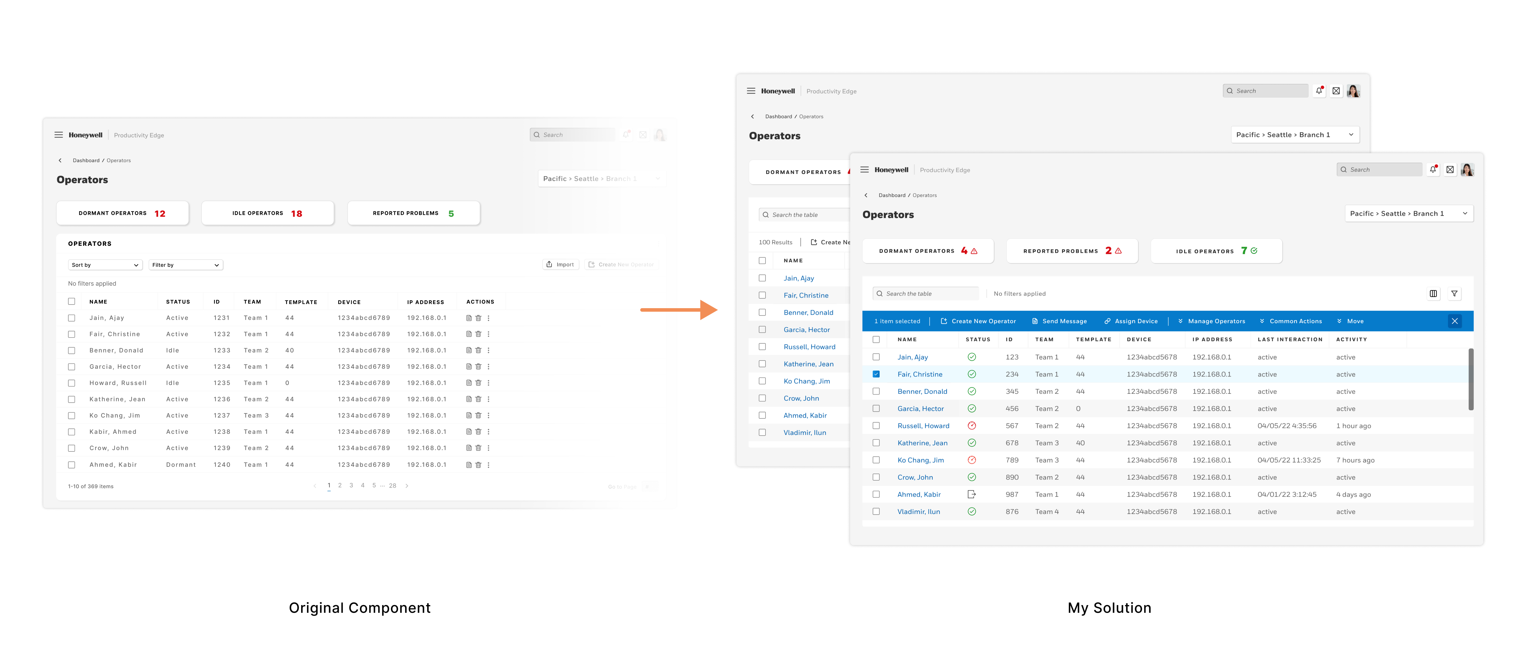
The original data table component is used in over 70% of the Productivity Edge app and the original component does not meet the product needs.
Project Background
The efficiency of Honeywell’s people managing app, Productivity Edge, depends on the ability to allow our users to parse and interact with large amounts of data.
70% of interactions utilize the data table component
The generic table that a different UX team created did not fit our use cases well. I will lay out what didn’t work, what I changed, and what my process involved. I pioneered multiple changes to the user interface to overhaul the data table experience and vastly improve usability.
What is Productivity Edge?
- A dynamic and powerful tool for managers to set goals and assignments for floor employees (operators).
- A viewpoint into the efficiency and productivity of their facility – including both hardware and manpower.
Who are our Users?
User Types
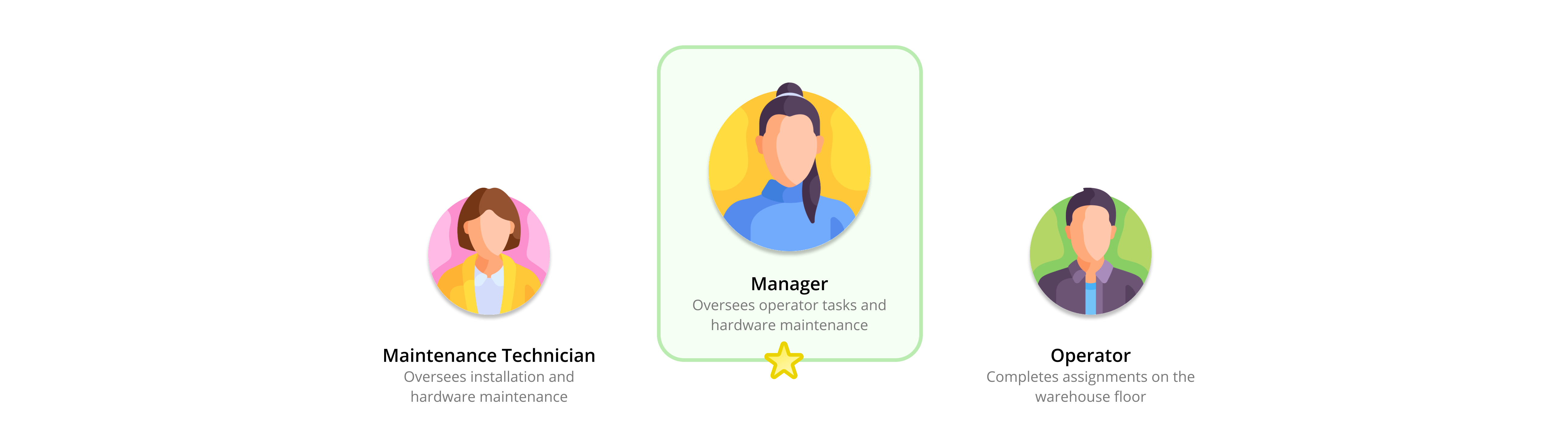
We account for three users in many Honeywell productivity apps. Manager, Maintenance Technician, and Operator. This case study focuses the Manager’s user journey.
- Manager – Oversees operator tasks and is responsible for hardware maintenance and reliability.
- Maintenance Technician – Responsible for the installation and maintenance of all hardware.
- Operator – Reports to the Manager and works to complete assigned on the facility floor.
Flow Diagram
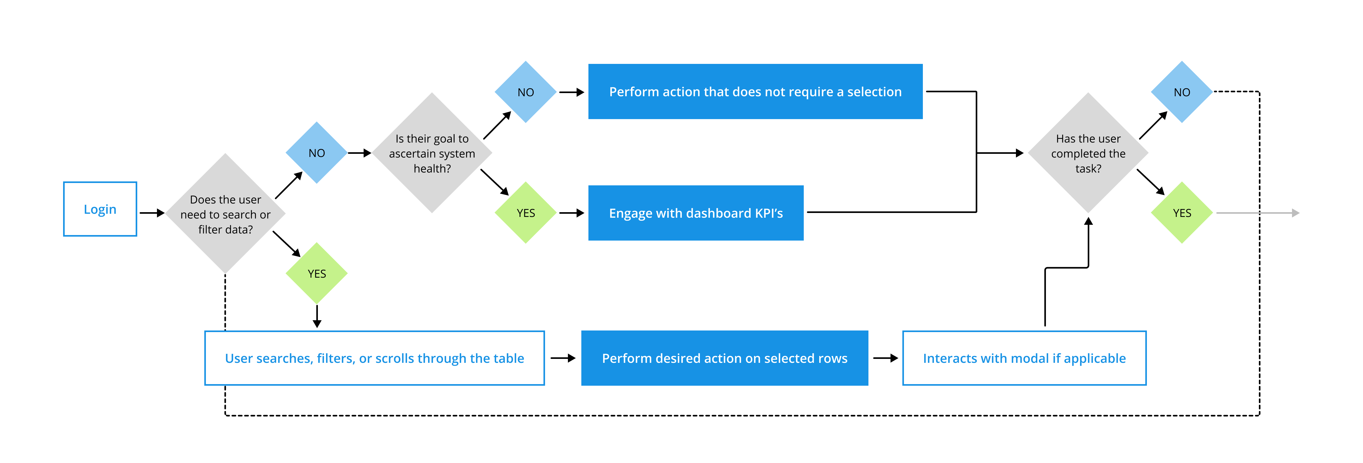
Let’s look at how Managers use the app and what some of their goals and experiences are:
- View dashboard KPI’s to ascertain the current status of employees and hardware
- Filter and sort data to minimize cognitive loads and drill down to the datasets relevant to their task(s) at hand
- Manage operator assignments by performing an administrative action on one or many operator rows
- All tasks require optimal navigation through screens in order to enable managers to quickly accomplish their tasks
Problems with the Generic Table UI
Original Design
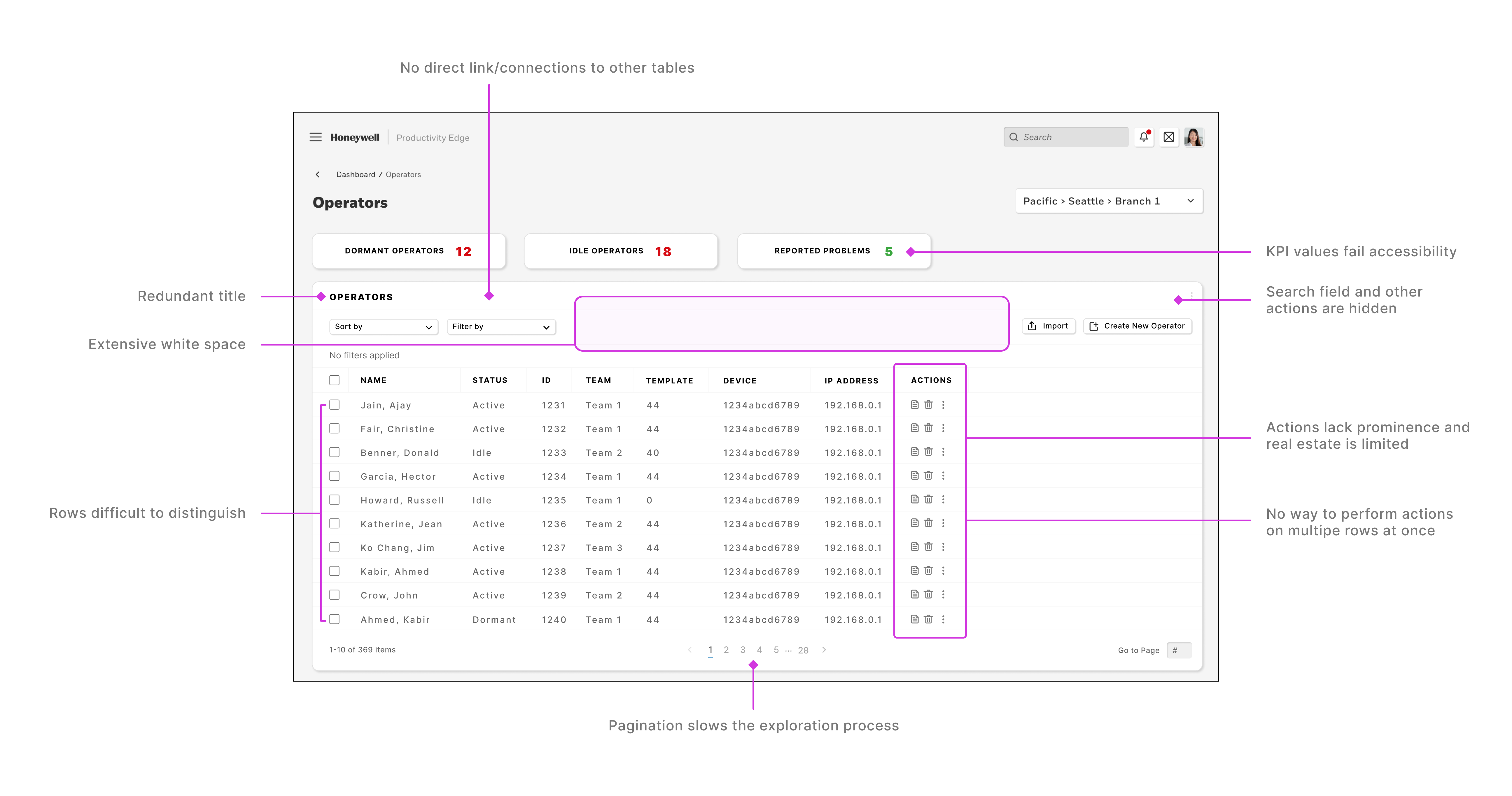
Here are some of the issues that I encountered as I was examining the original data table component and familiarizing myself with the research that had been done prior:
- Researchers have told us that users often take too long to find the data they’re searching for.
- Dashboard KPI modules fail accessibility tests.
- Actions are not given enough real estate in each row. This is especially notable because performing actions on the operator rows is one of the key experiences of this product.
- There is also no way for a user to perform actions on multiple rows at once.
- There is too much redundancy and wasted real estate in the table header UI components.
- Pagination slows the exploration process.
Design Principals
Understanding the Problem
What solutions are we providing?
Focusing on User Goals
What are they trying to accomplish?
Increasing Accessibility and Usability
What can equip the user for success?
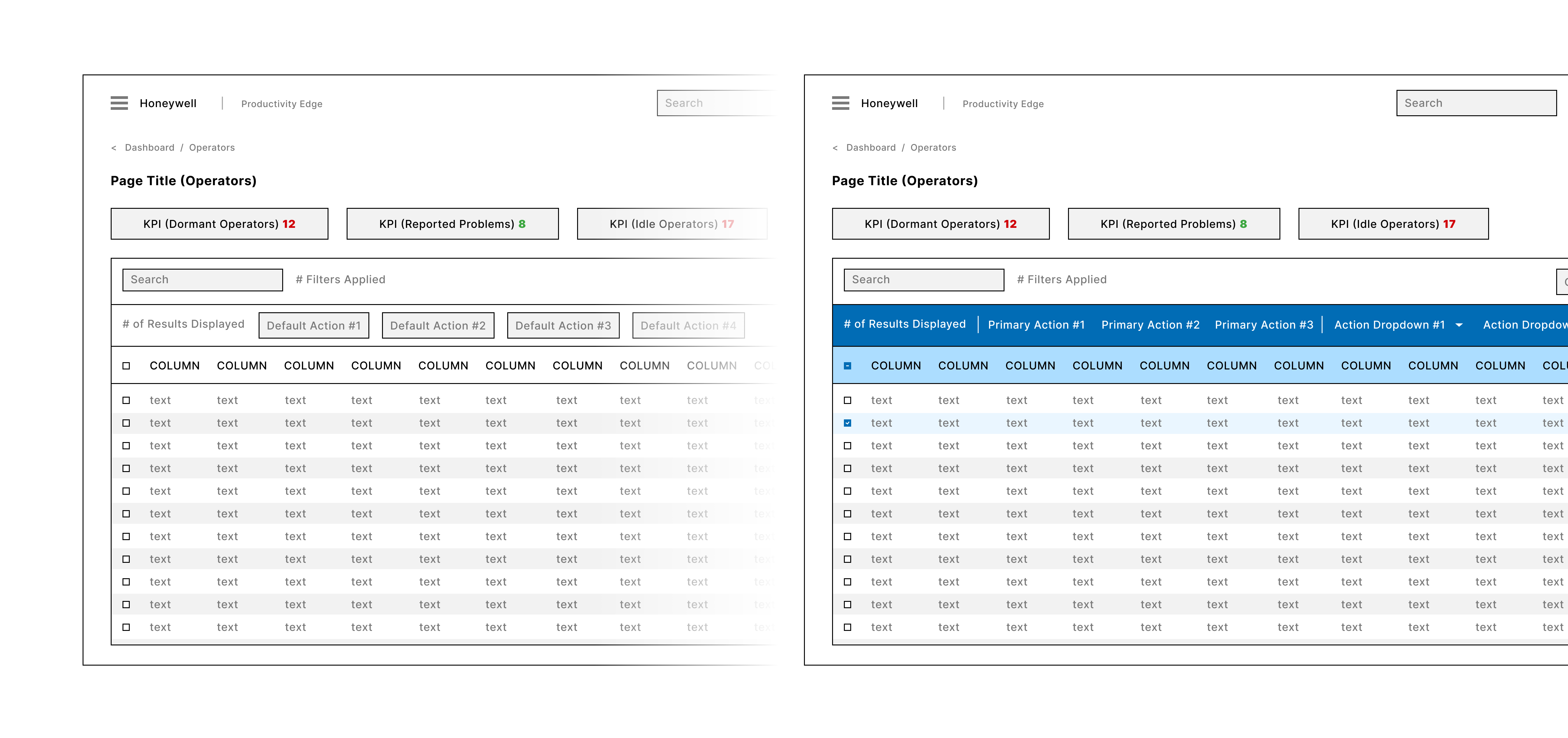
Wire Frames
Building the Design Framework
High Fidelity Mockups
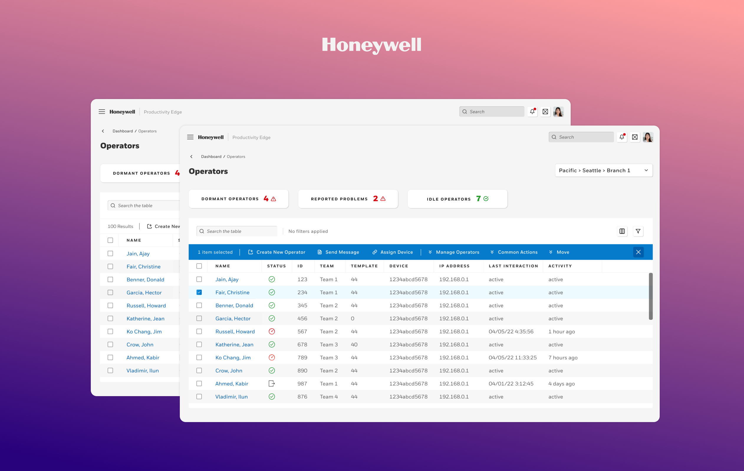
Unselected Table
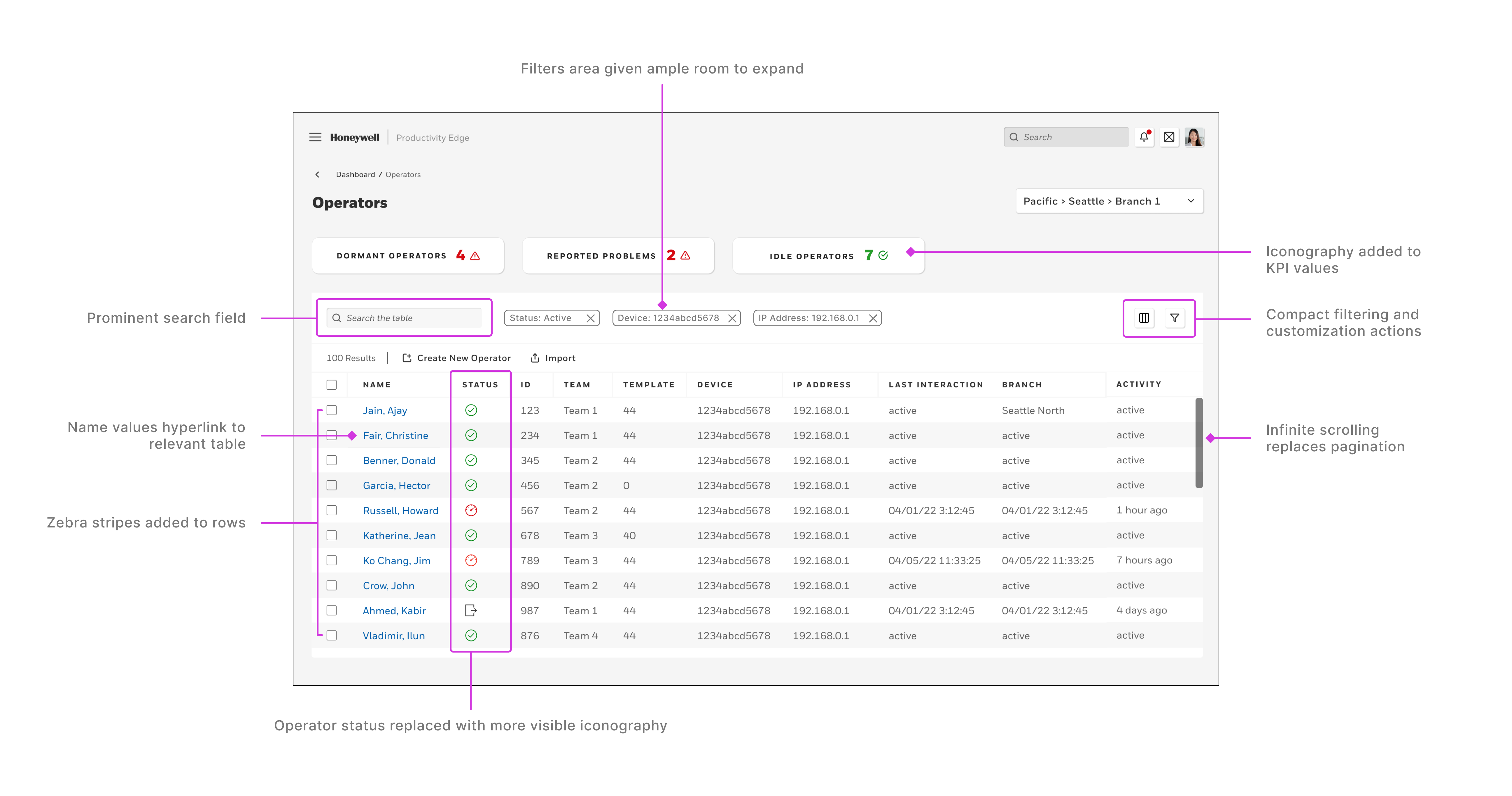
The component has been redesigned to account for the issues of the current table component.
- The accessibility of the KPI data has been improved by including iconography to accompany the red and green values.
- The search bar has been moved into a prominent place in the UI.
- The filter menu has been reduced in size and moved to a less prominent area on the right-hand side of the UI.
- The active filter tags have ample room to be fully displayed.
- Zebra stripes have been added to help the user better distinguish the data on each row.
- The Operator status column values have been converted from plain text to color-coded icons for better visibility.
- Pagination was swapped out for infinite scrolling to allow for easier parsing of data.
- Hyperlinks have been added to the primary column (in this case the operator name) to foster direct navigation within sections of the app.
One Row Selected
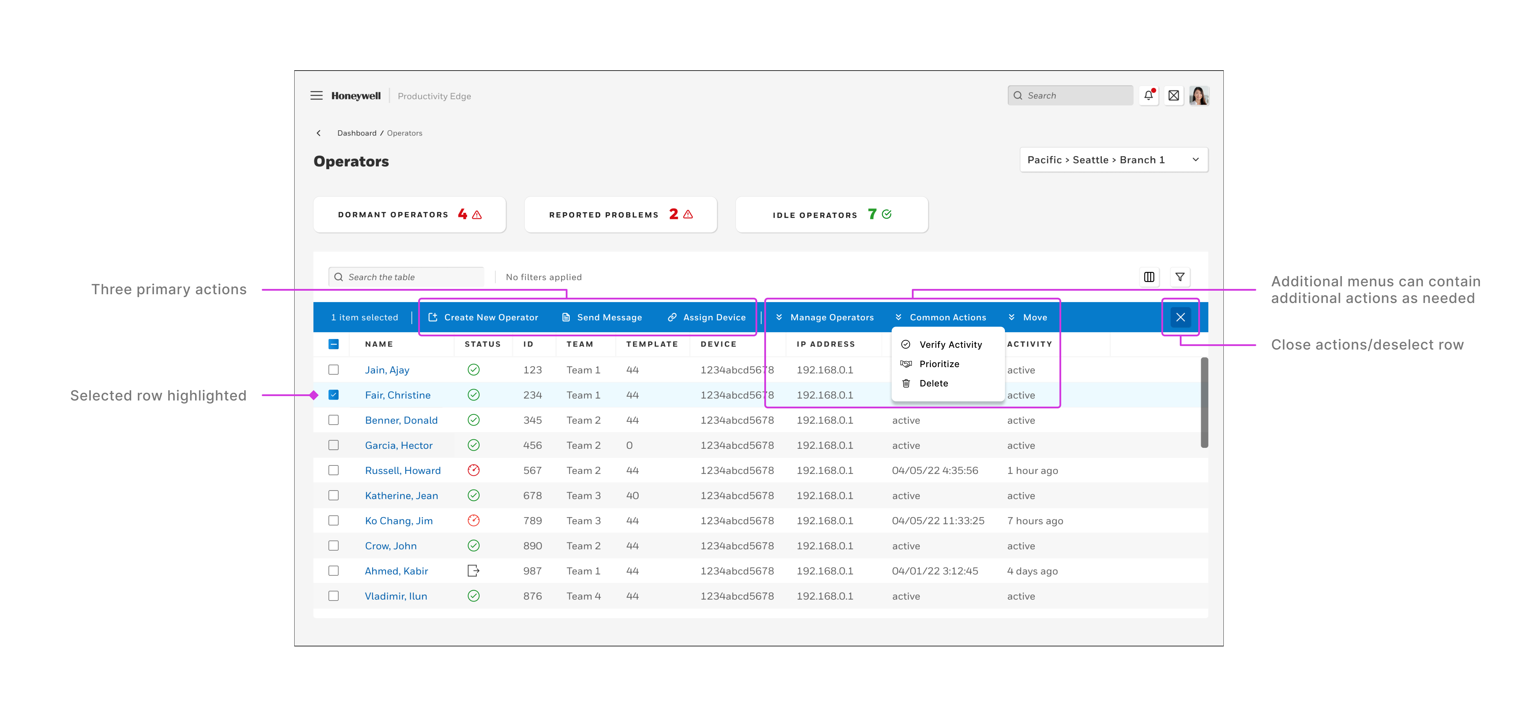
Row selection is the bread and butter of this interaction. When a row is selected, the blue action bar appears. It contains (from left to right) the number of selected rows, three primary actions, and space for up to four drop down menus that contain any additional actions needed.
When multiple rows are selected, the process is the same. Any actions that are displayed are relevant to the selection. An action such as “Edit Operator Details” is only available when that individual operator is selected and will thus not appear when multiple operators are selected. “Delete” however, can apply to as any number of operators.
Create New Operator Modal
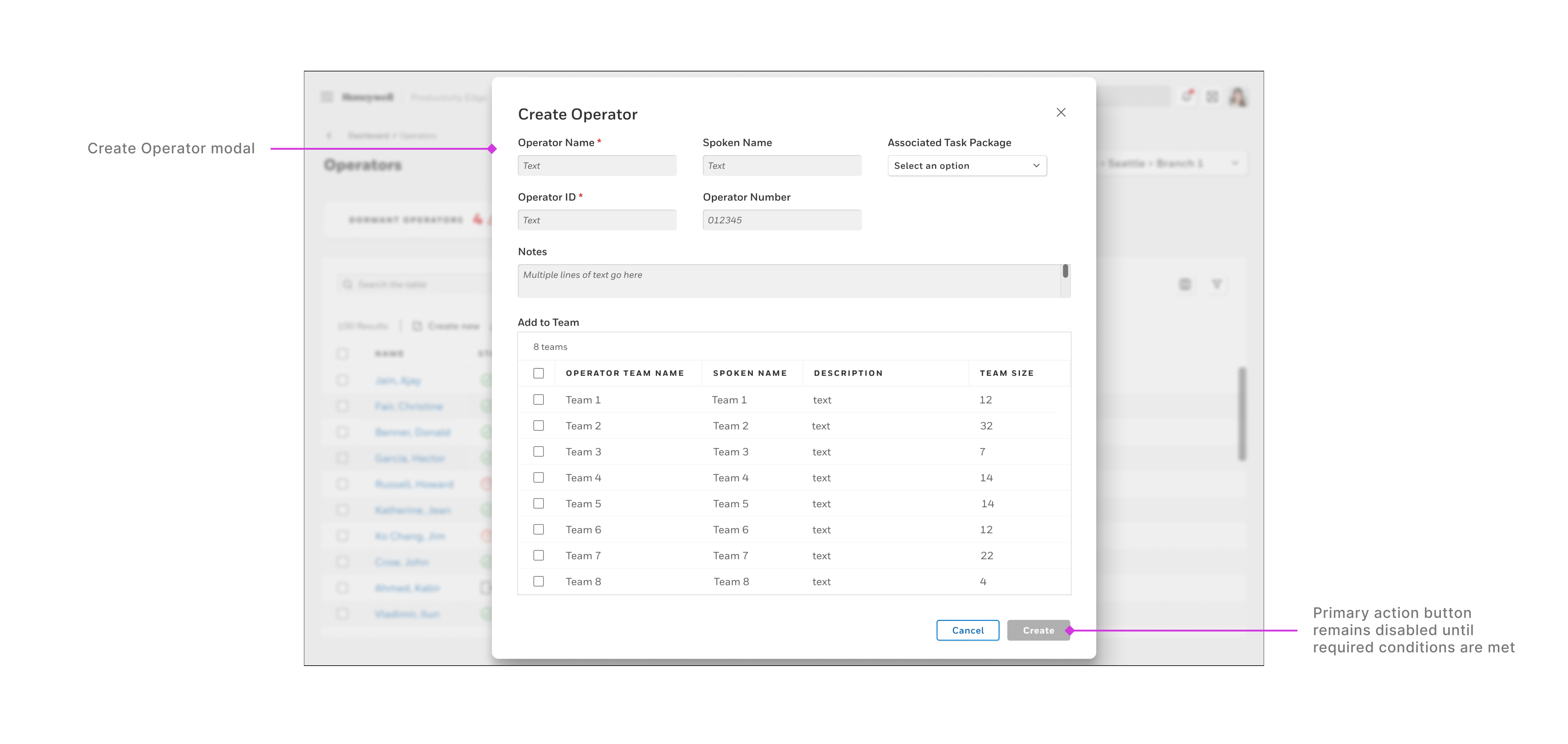
The “Create Operator” action is a modal that’s launched by the user and enables the user to input operator details and to assign them to a group. This action does not require a row selection.
Send a Message Modal
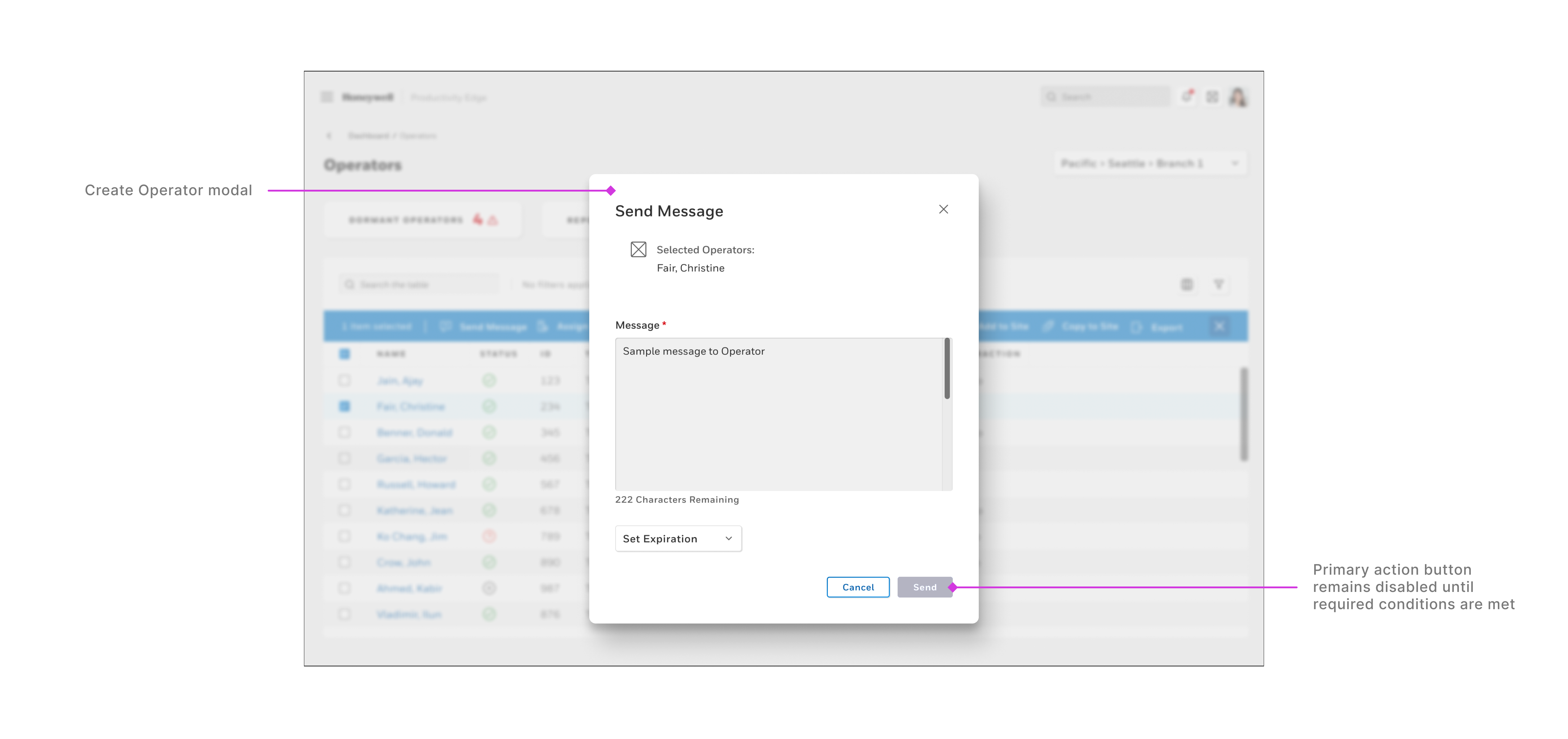
The “Send Message” modal enables the user to send a message to a selected user. If multiple rows/operators in the table are selected, the user can send a message to as many operators as they would like.
Conclusions & Next Steps
The table UI redesign provided a great opportunity to become integrated with a stellar team that was passionately working to deliver a complex new product from scratch.
What I Learned
- It’s not a simple thing to redesign a component. Designers and other stakeholders ready use it and have use cases already planned out. Product and engineering teams are already familiar with its features and we shouldn’t change something for no reason. Making changes such as this involves everyone, and requires their cooperation.
- The value of building trust among colleagues and teams is paramount. When I propose a change and explain why, I need to have open conduits of communication.
- Why this component was design the way it was in the first place. The use cases were different. It was simply not designed for my use cases. During this process I connected with the team that created and maintained the design components and shared my work with the aim that my variation could become an official component that other teams could leverage.
- I gained a clear understanding of the good, bad, and the ugly of how businesses build their design teams and design systems. How do politics affect discourse? How to tactfully and skillfully communicate that an existing solution may not be the best and what to do about it.
Next Steps
- Continue to iterate and expand the app to cover all of the user and business needs.
- To continue to share the UI and product direction with current customers to receive their feedback.
- To work closely with our research team to validate improvements to the experience and interface to ensure that our work is moving in the right direction.
