
UI/UX/Product Designer
Redesigning the History Department’s Website
A closer look at the redesign of Carnegie Mellon University's Department of History's website, taking user research and current design trends into account.
A closer look at the redesign of Carnegie Mellon University’s Department of History’s website, taking user research and current design trends into account.
Overview
I met with stakeholders and engaged users in co-design workshops to understand how this website could best serve their needs, while adhering to university guidelines and best practices for their content management system. I prototyped various layouts in order to properly understand the information hierarchy.
Role
Lead UI Designer
Duration
Five months, which included comparative analysis, stakeholder meetings, and development
Tools
Adobe Photoshop, XD, Cascade Server CMS
Key Features
- Led co-design workshops and conducted interviews with faculty, staff, and students
- Derived a hierarchy of information to present on the site’s home page based on user research
- Created a visual heavy design, steering away from large bodies of text, as commonly found on academic websites
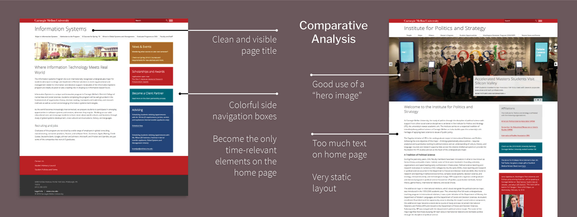
Comparative Analysis
I began this process by examining the content not only on the earlier History Department website, but I looked around the university to see what other departments were doing.
In general, my examination showed me that the bigger the academic unit, the nicer their website was. I aimed to alter that trend, as the History Department is a relatively small unit, however one rich in content.
Many home pages of academic websites feature paragraphs and paragraphs of text, taking up valuable screen real estate for content that (at best) may only be read once. The existing History Department website was no different.
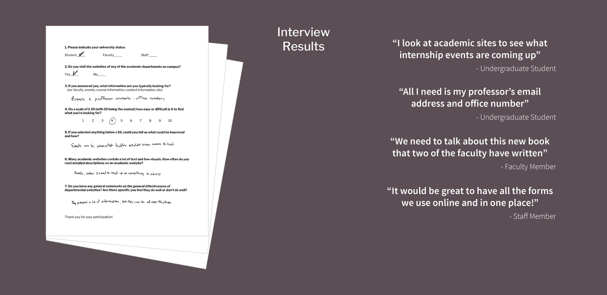
Interviews
To truly understand the revisions that needed to be made on the new website, I needed to seek input from various stakeholders.
I began by interviewing people who work in the History Department office; the department head, the supervisor, and the undergraduate students. It was interesting to learn what content each user group ranks as the most important. Not surprisingly, there were some large differences.
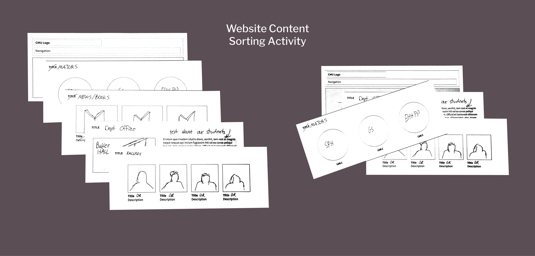
Co-Design Workshops
To get a better sense of what key stakeholders envisioned, and to better communicate my vision to them, I printed out sets of circles and squares to depict UI elements. A group of faculty members met and participated in a flexible modeling exercise where we arranged the sheets of paper in different ways.
To help the faculty visualize what we were doing, we drew symbols into the various blank shapes that were in front of us. That activity helped to everyone to better connect these abstract forms to actual content that would likely appear on their website.
Piecing the Content Together
Upon completion of the interviews and workshops, I am able to build a visual model of what is affecting the content for this site.
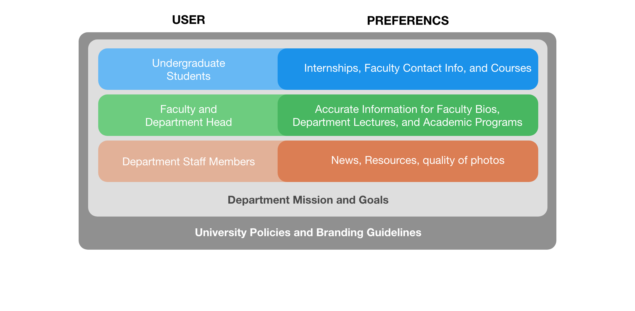
Utilizing this simple model, I was able to create a visualization for myself to better understand the various categories of content and the relevance of each.
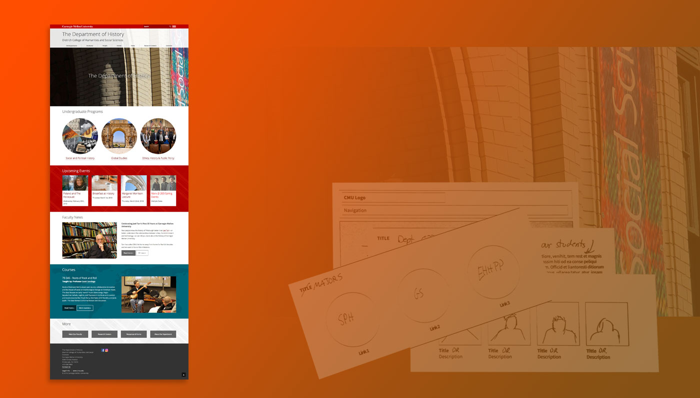
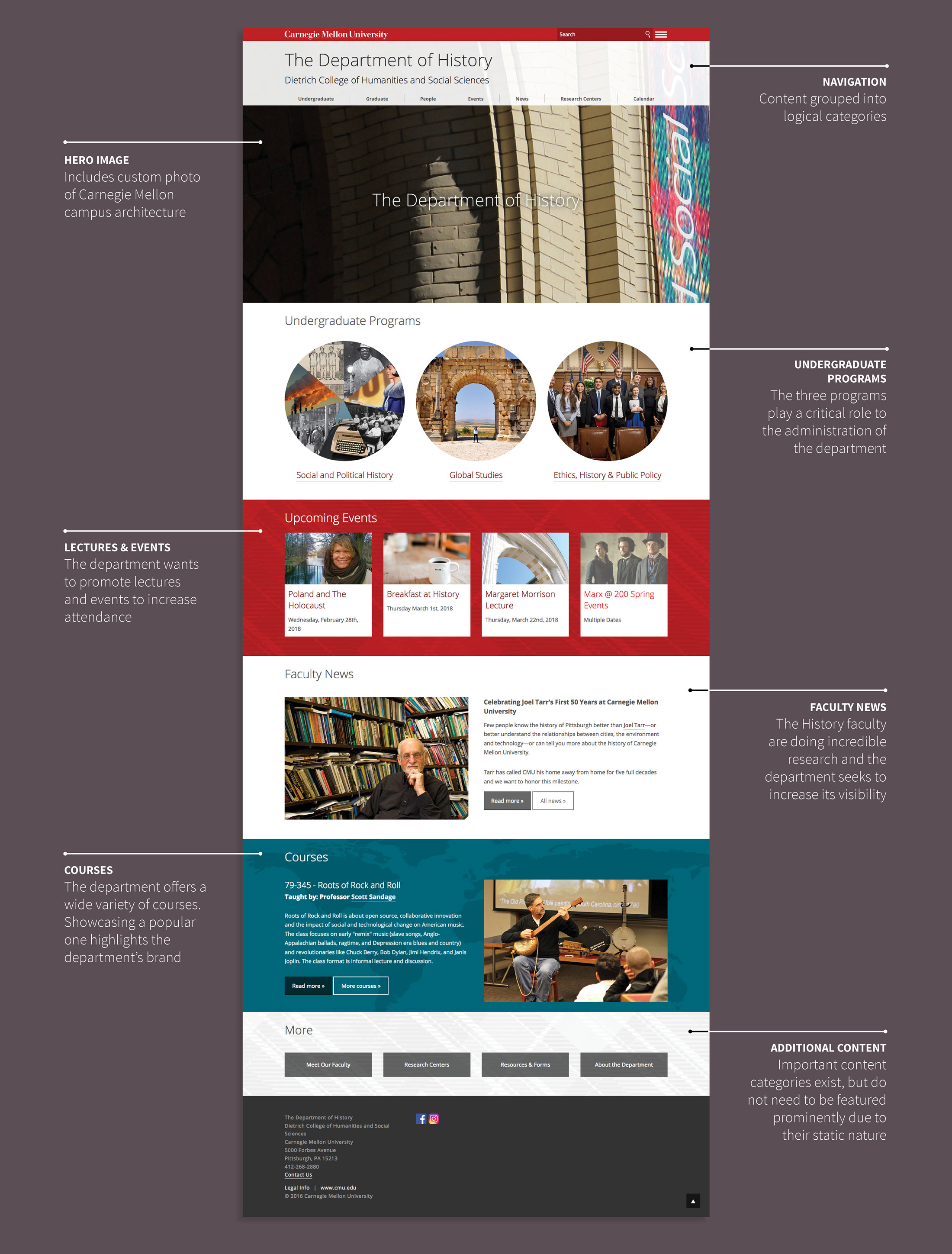
Final Prototype
Below is an annotated screenshot of the proposed homepage.
Technical Notes
Carnegie Mellon University’s computing services offers a content management system (CMS) which is what this site is run on. While that may have placed constraints on the originality of the design, the CMS allows for a large degree of artistic freedom within the confines of its code. Furthermore, I have gained an expert understanding of how to manipulate this brand of CMS.
My expert knowledge of HTML & CSS has served me well, as it has enabled me to fine tune details that I would not otherwise have access to. My eye for layout and graphic design has led me to make every page as visually appealing as possible. I have built up a vast collection of photographs of the university and campus. They are a great resource for me to use in the development of this and other websites.
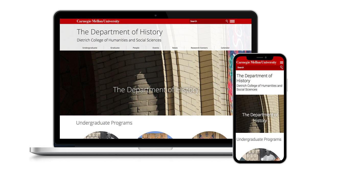
Visit
The Department of History website launched in March 2018.
